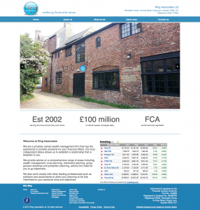
They wanted to modernise not only the site but also the logo. The old site they had was very blue and wouldn’t work on mobiles or tablets very well. There website was used regularly as clients would access portfolio information and keep up to date with market trends. The design had to be clean, with easy navigation and had to be responsive to work on any device. The logo was trademarked so certain parts had to remain the same.
With the logo I made it more modern and brought a 3D effect to it below is the before and after.
![]()
![]()
The site was simplified with a fixed navigation bar at the top so that anyone could easily get from page to page no matter where they were on the site.